 Getting Started
Installation
Chat with Copilot
Usage Limits
Prompting
Prompt Context
Capabilities
Prompt Tips
Styles and Prefabs
Flexalon Styles
Prefab Sets
Account & Subscription
Get Support on Discord
Getting Started
Installation
Chat with Copilot
Usage Limits
Prompting
Prompt Context
Capabilities
Prompt Tips
Styles and Prefabs
Flexalon Styles
Prefab Sets
Account & Subscription
Get Support on Discord
Prefab Sets
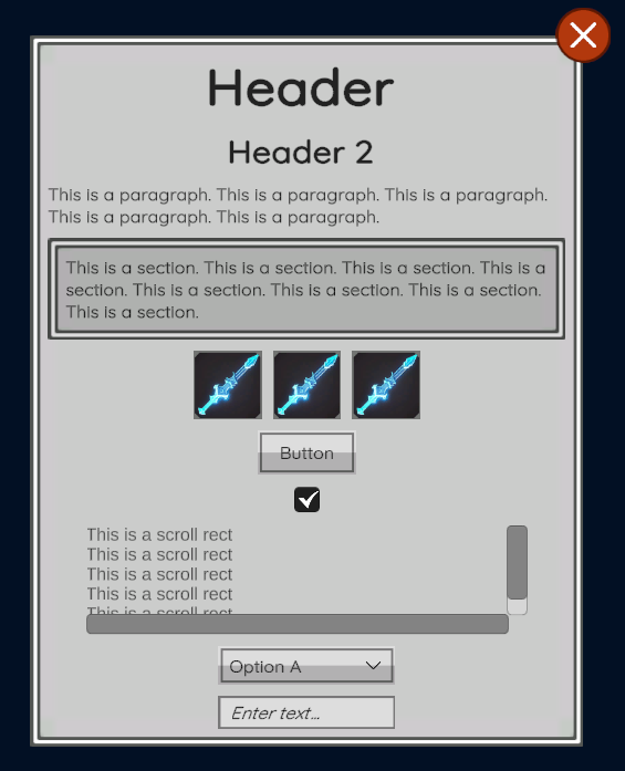
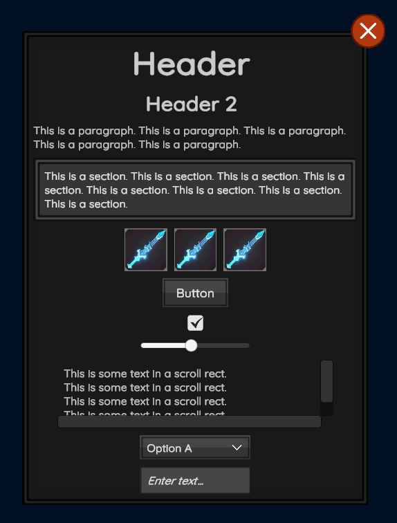
When you prompt Flexalon Copilot to generate UI elements such as buttons or input fields, it instantiates these elements from a set of built-in prefabs.
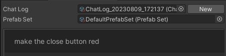
To use a different prefab set, assign it in the chat window:
Built-in Prefab Sets (Themes)
You can find these built-in prefab sets under FlexalonCopilot/Themes.
Light Prefab Set
Dark Prefab Set
Custom Prefab Sets
To create your own prefab set, you can duplicate the default one or click Assets > Create > Flexalon Copilot > Prefab Set.
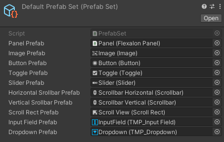
Your prefab set must meet some basic requirements for Flexalon Copilot to edit them correctly:
| Panel | Will be used for top-level windows, dialogs, and sections. Must have a Flexalon Panel component. |
| Image | Must have a UGUI Image component. |
| Button | Must have a UGUI Button component. |
| Toggle | Must have a UGUI Toggle component. |
| Slider | Must have a UGUI Slider component. |
| Scrollbar | Must have a UGUI Scrollbar component. |
| Scroll Rect | Must have a UGUI ScrollRect component with the 'Viewport' field assigned and 'Content' field left unassigned. |
| Input Field | Must have a TMP_InputField component with Text and Placeholder fields assigned. |
| Dropdown | Must have a TMP_Dropdown component. |